Back
Simplicity in Design 1/100
Simplicity in Design 1/100
by Trace Hayes
Jun 9, 2012
We were discussing in the office today how the much needed new trend is simplicity in design & how many over design to the point of distraction. White space IS GOOD! (I’ll write more about that another day).
The discussion led us to talking about infographics & our love for them (when done right).
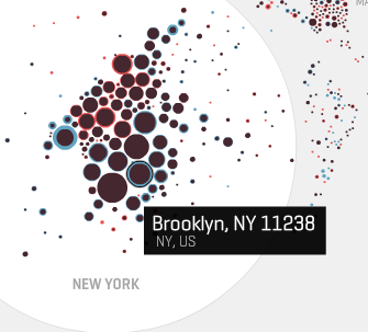
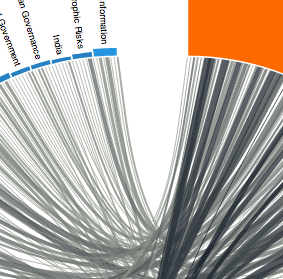
A great info graphic should be simple, beautiful & educational. Here are a couple of gorgeous examples of information graphics that marries both technology & information.
http://moritz.stefaner.eu/projects/map%20your%20moves/
http://www.janwillemtulp.com/worldeconomicforum/
Back
The discussion led us to talking about infographics & our love for them (when done right).
A great info graphic should be simple, beautiful & educational. Here are a couple of gorgeous examples of information graphics that marries both technology & information.
http://moritz.stefaner.eu/projects/map%20your%20moves/
http://www.janwillemtulp.com/worldeconomicforum/
-
The Hidden Secrets of UX
It’s often said that the best design is invisible. After all, a user trying to accomplish a task on a website or app is likely thinking about their goal and not the site (in the same way that a person cooking dinner is thinking about the food and not the spatula). More often than not, the goal of the designer is simply to get out of the user’s way.
Continue Reading -
The power of collaboration in Design
A very interesting read on design and collaboration.
Continue Reading -

What your logo fonts say about your business
Great logos are designed by bringing together various design elements that are perfect for a particular brand. One of these, without a doubt, is the font.
Continue Reading


